Do you ever wonder why your immigrant ancestors to the U.S. settled in a particular location, especially if it wasn’t the port city they landed in? The New York Times website has a tool that may shed light on your question.
This very cool interactive map displays the settlement patterns of U.S immigrants by nationality since 1880. As you can see from the screen shot below, you can click on ten-year increments to see how things stood at one point in time, or click across several to see how settlement patterns changed.
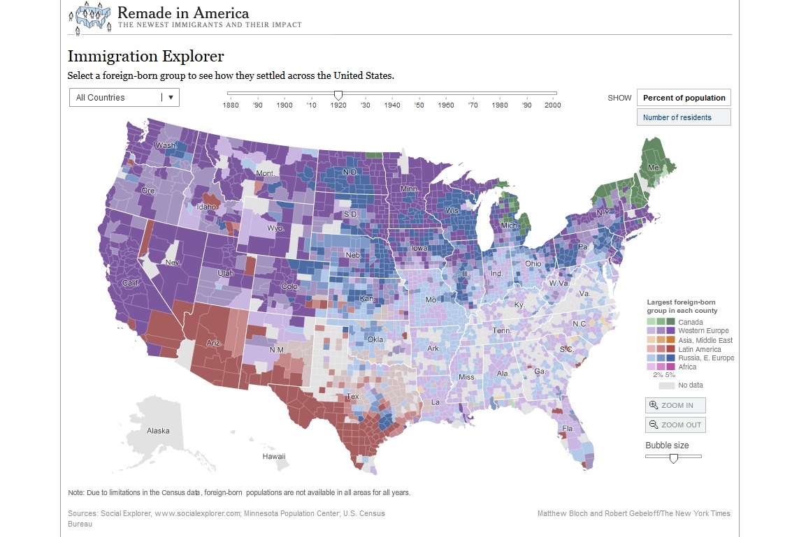
You can also click on several individual countries for more specific data, as you see here:

Of course, you may still be scratching your head about WHY your folks went a particular place. But if you see they were part of a larger settlement of Poles in the Pittsburgh region in the early 1900s, for example, you’ll know to look for regional and ethnic histories that can give you more “backstory.” You may also discover that they were a definite minority in their new hometown, which hints at a different kind of immigrant experience. In the quest to understanding our immigrant ancestors’ experiences, every clue helps!
You can learn more about another terrific immigration resource by listening to the free ![]() Genealogy Gems Podcast episode 120. Noted author Steve Luxenberg (Annie’s Ghosts) shares a free online tool that he used to help solve his own family history mystery!
Genealogy Gems Podcast episode 120. Noted author Steve Luxenberg (Annie’s Ghosts) shares a free online tool that he used to help solve his own family history mystery!